Chandra Mishthan Bhandar
Sweet Shop / NamkeenBrand identity · Sample project
CHANDRA
चंद्रा
Mishthan Bhandar · Since 1988
01 · The problem
A 37-year-old shop with a hand-painted board that had been repainted four times, each time slightly differently. The box said one name, the bill book another, and the WhatsApp display picture was a photo of the counter.
02 · The approach
Fix the name in both scripts first, then build one mark simple enough that a wall painter, a flex shop and a box printer all produce the same thing. Nothing in the identity needs more than two colours.
03 · The result
One name, one mark, one set of files. The shop now hands the printer a file instead of a photograph of the old board.
01
How the mark is built
The mark sits on a circle divided into eight. The C is drawn on that grid so anyone redrawing it — a painter, a signboard shop — lands in the same place.
02
Clear space & minimum size
- Clear space
- Keep clear space all around equal to the height of the C. Nothing — no phone number, no border — enters that space.
- Minimum size
- Never smaller than 15 mm wide in print, or 40 px on screen. Below that the wordmark drops and only the C is used.
03
Logo variants
- CHANDRA
Primary lockup
Board, packaging, anywhere with room
- CHANDRA
Horizontal
Bill book header, letterhead, website top
Icon only
WhatsApp photo, app icon, small stickers
- CHANDRA
Single colour
Rubber stamp, kraft boxes, one-colour print
04
What not to do
Do not stretch or squash
The most common damage. Scale from a corner, never from a side handle.
Do not recolour
Maroon and gold only. A green Diwali version is a different shop to a customer.
Do not add shadows or glow
Effects added at the flex shop turn to mud when printed large.
Do not place on a busy photo
Use the single-colour version on a plain patch instead.
05
Colour palette
- 45%
Deep Maroon
#8C1D2F
C25 M100 Y75 K20
Primary — board, box, headings
- 20%
Festival Gold
#C9992E
C15 M40 Y100 K5
Accent — borders, festive work
- 25%
Warm Cream
#FDF7F0
C0 M3 Y7 K0
Background — paper, bags
- 10%
Ink Brown
#3D1B1B
C40 M75 Y70 K60
Body text and small print
CMYK is given for every colour, because a local press cannot use a hex code — and the bar above is the proportion to keep, not a suggestion.
06
Typography
Georgia / Playfair Display
Headings
Inter / Mukta
Body text
Mukta — देवनागरी
Hindi
- Shop boardCHANDRA18 in cap height · Readable from across the road
- PackagingChandra24 pt · Box lids and carry bags
- Small printMain Road, Motihari · 90000 000009 pt minimum · Never smaller, or it fills in when printed
A serif for the name so it reads as old and trusted, and Mukta for Hindi because it stays legible when the board is painted rather than printed.
07
Shop board
CHANDRA
चंद्रा
Mishthan Bhandar · Since 1988 · +91 90000 00000
08
Visiting card
CHANDRA
Mishthan Bhandar · Since 1988
Proprietor Name
+91 90000 00000 · Motihari, Bihar
09
Bag & bill book
10
Before and after
Before
A hand-painted board repainted four times, each with a different letterform. Two spellings of the name, a phone number added later in a different colour, and clip-art sweets in the corner.
After
CHANDRA
चंद्रा
+91 90000 00000
One spelling, one mark, one typeface. The phone number is part of the layout instead of squeezed in afterwards, and the board can be reprinted from a file rather than repainted from memory.
11
Arc pattern
Built from the same arc as the C. Used at 10% opacity on box interiors, bag gussets and festival post backgrounds — it fills space without competing with the mark.
12
Stationery
- Letterhead — A4, mark top-left, GST and address in the footer
- Envelope — 9x4 in, single colour to keep it cheap
- Rubber stamp — Icon only, 30 mm — the mono version
- Staff ID card — For delivery staff at festival time
13
Signage system
Main shop board
12 x 4 ft
Flex, read from across Main Road
Glass door decal
18 x 18 in
Icon plus timings, white vinyl
Counter backdrop
6 x 3 ft
Where every customer photo happens
Delivery box sticker
3 in round
Seals the box and brands it at once
14
On screen
- ·WhatsApp display picture — Icon only — a full lockup is unreadable at that size
- ·Instagram profile & grid — Highlight covers in the two brand colours
- ·Website header — Horizontal lockup, 40 px tall
- ·Google Business profile — Square icon and a cover from the counter backdrop
15
Photography
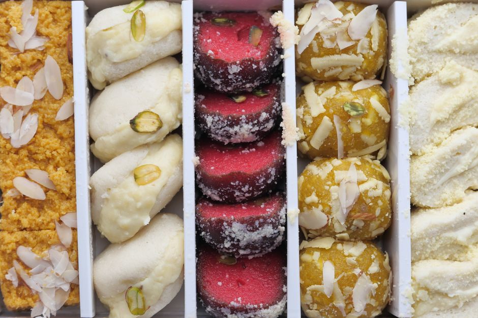
Sweets photograph badly under tube light — everything turns green. Shoot near the shop door in daylight, on the brass tray, from slightly above.
Do
- ✓Daylight near the door, never under tube light
- ✓Brass or steel tray, plain cloth behind
- ✓Fill the frame — one sweet, not the whole counter
Do not
- ✕No phone flash — it flattens everything
- ✕No app filters that shift the maroon
- ✕Nothing shot at night under a mixed light
16
How it should sound
- 01
Hindi first, always
“आज की ताज़ा मिठाई” — not “Today’s Fresh Sweets”
- 02
Price in the sentence
“काजू कतली ₹840 किलो” — never “rates on request”
- 03
No claims we cannot show
“1988 से” is provable. “शहर की सबसे अच्छी मिठाई” is not.
17
Where it gets used
CHANDRA
चंद्रा
- Shop boardName in both scripts, phone large enough to read from the road, no clutter.
- Sweet boxOne-colour print on kraft so the cost per box stays under a rupee.
- Bill book & bagThe same mark on everything a customer carries home from the counter.
- Festival creativeA Diwali and Chhath template the shop can reuse each year by swapping the date.
18
What you receive
- ✓Primary mark, horizontal lockup and icon-only version
- ✓Hindi and English wordmarks that sit together correctly
- ✓Print files in CMYK with a colour reference sheet for your press
- ✓Visiting card, bill book header and carry bag artwork
- ✓Shop board layout at actual size, ready for the flex shop
- ✓One-page brand sheet so any printer gets it right without calling you